6  Alternative Analysis

This chapter addresses some of the weaknesses in the data set, comparing corrections to the base level used by Subcreation. Each subpart here addresses a specific shortcoming.

6.1 Using the full sample

One thing I don’t particularly like about the data analysis is restriction to the top 100 runs. it will ignore the more difficult dungeons, which we collected via stratified sampling. We can ask what happens if we just compute a confidence interval on the full sample, in the traditional way. This avoids all the broken computations which blends data from the top-100 and the full sample.

healers_full_sample <- healers |>
  group_by(class_spec) |>
  dplyr::reframe(
    class = class,
    score_mean = mean(score),
    score_sd = sd(score),
    n = n(),
    error = qt(.975, n-1) * score_sd / sqrt(n),
    conf.low = score_mean - error,
    conf.high = score_mean + error,
  ) |>
  distinct() |>
  mutate(analysis = "full-sample")

healers_full_sample |>
  dplyr::select(class_spec, n, score_mean, score_sd, conf.low, conf.high) |>
  kbl() |> kable_styling()
class_spec n score_mean score_sd conf.low conf.high
druid_restoration 2629 207.8359 9.258906 207.4818 208.1900
shaman_restoration 263 201.8970 10.469140 200.6258 203.1681
priest_holy 441 197.1732 10.830588 196.1596 198.1869
monk_mistweaver 403 202.7854 9.748918 201.8307 203.7400
priest_discipline 206 201.9272 9.978926 200.5564 203.2980
evoker_preservation 151 202.9298 10.809741 201.1916 204.6680
paladin_holy 236 196.9441 10.661428 195.5768 198.3113

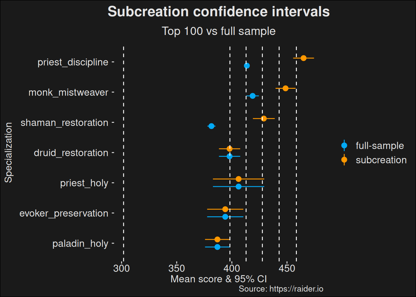
The way we’ve set up data frames with an analysis tag will let us compare the difference between the two ways of computation. Here we use colors to differentiate between the methods used by Subcreation, and using the full sample. Note how the popular specs are beeing reeled in. This is to be expected, because when we don’t pick the top-100 for those specializations, we are not selecting the best runs among the higher population count.

Some players are likely to be better than the average of our selected runs, and some are likely to be worse. Subcreation just picks all the lucky dice throws, and ignores all the unlucky ones. I’m arguing this is a bad practice, because the popular specs get far more dice throws than the less popular specs.

Code
healers_subc_base <- healers_subc_base |> dplyr::select(-spec_score_mean)
ggplot(union_all(healers_subc_base, healers_full_sample),
  aes(
    x = reorder(class_spec, conf.low),
    y = score_mean,
    color = analysis,
    ymin = conf.low,
    ymax = conf.high)
  ) +
    geom_pointrange(position = position_dodge(width = .5)) +
    geom_hline(yintercept=clusters$centers, lty="dashed", color="white"  ) +
    coord_flip() +
    labs(title = "Subcreation confidence intervals",
         subtitle = "Top 100 vs full sample",
         caption = "Source: https://raider.io",
         x = "Specialization",
         y = "Mean score & 95% CI") +
    scale_color_material_d(palette = "light")
Figure 6.1: Plot where we compare the original Subcreation model (top-100 runs) to the full sample data where all runs are included. The intent is to show there’s a difference based on what model you decide to use. How you decide to handle your data can have a large effect on the outcome and also the conclusion people will end up making based on the data.

6.2 Regional Effects

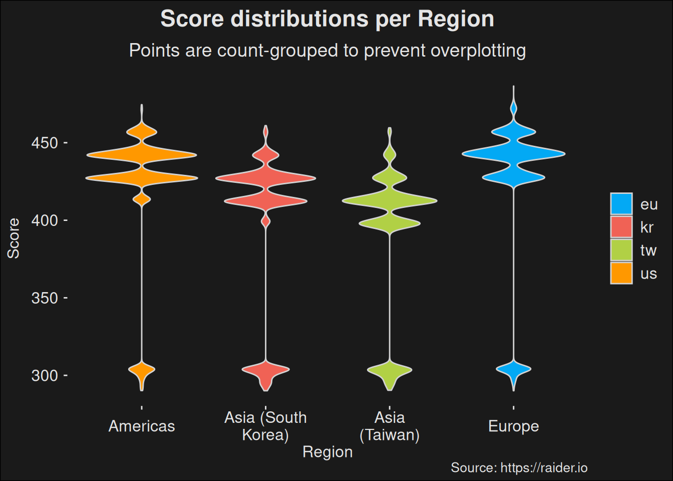
The choice of stratifying by region ensures we are getting a share of runs from every region. But because we are also purposively sampling the top players, it is important to ask if there are any regional differences. We can do that via a quick violin-plot over all the data, but split by region.

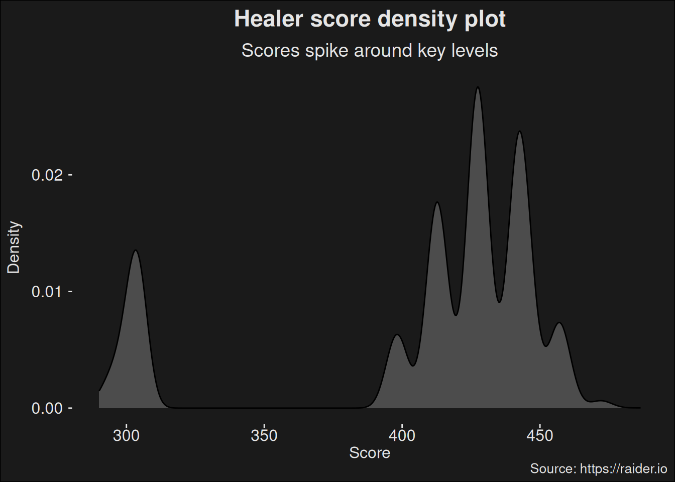
Violin-plots are in the family of density plots. In statistics a density (Probability Density Function / PDF) tells us the relative likelihood of drawing a value from the distribution. Where the distribution has mass, there is a larger likelihood of getting a value. In the violin-plot, we can see that scores are more likely to be around certain threshold values. These correspond to key-level increases. The variance within a given key level pertains to the clock and how much time was left on it. In “between” key levels, there are no observations at all, so the density violin becomes very thin.
Code
ggplot(specs, aes(x = region.str, y = score, fill=region)) +
  geom_violin(color="lightgray") +
  labs(title = "Score distributions per Region",
       subtitle = "Points are count-grouped to prevent overplotting",
       caption = "Source: https://raider.io",
       x = "Region",
       y = "Score") +
  scale_fill_material_d(palette = "light") +
  scale_x_discrete(label = scales::label_wrap(12))
Figure 6.2: Score distributions split by region shows regional differences.

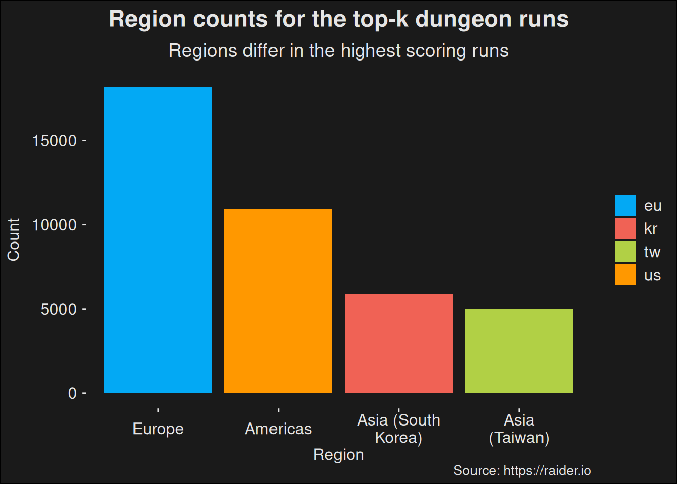
We see there are considerable effects from regional differences. Data from Asia are likely to have an effect on our results. In particular, we aren’t measuring the top players. It is very likely if we just pulled more data from the Europe and Americas regions, we would see a real view of the top players. The data set we are working with have the following regional counts

Code
specs |>
  group_by(region.str) |>
  summarize(count = n()) |>
  kbl() |> kable_styling()
region.str count
Americas 5600
Asia (South Korea) 5600
Asia (Taiwan) 5600
Europe 5600
Figure 6.3: Table counting the number of runs per region in the base data set.

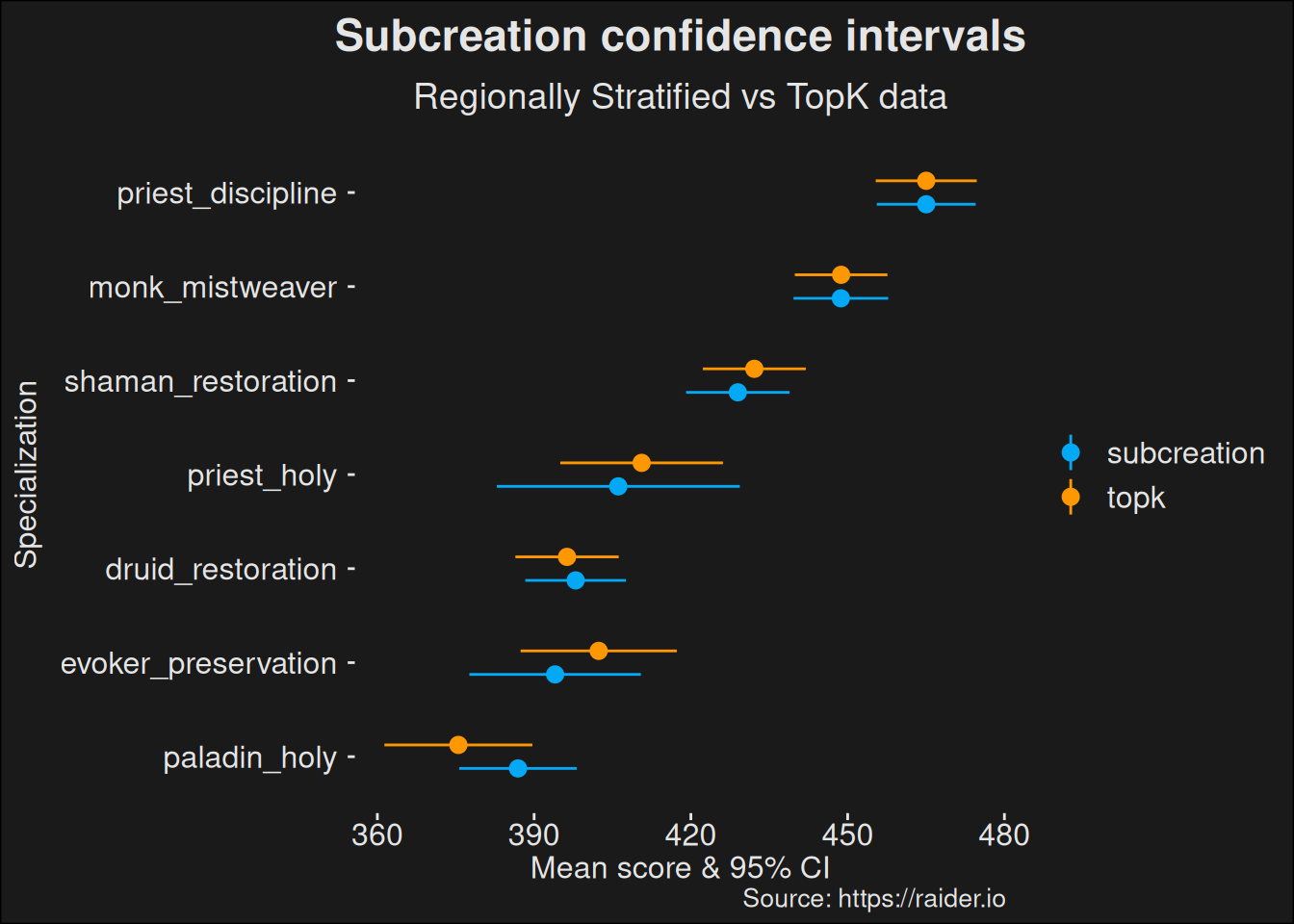
But we also have an alternative data set, where we find the world-wide top dungeon runs for the week. This dataset is called specs_topk. This data set have counts which differ:

It is worth stressing the regional difference is largely due to population counts. The regions with a lot of players will be able to push key levels quicker because there are more players running those keys. Hence, it is far easier to form groups. Also, because we are sampling among the top, a larger population in a region means we’ll have more skilled players in the region, even if we assume no skill difference.
Code
specs_topk |>
  group_by(region.str) |>
  summarize(count = n()) |>
  kbl() |> kable_styling()
region.str count
Americas 9265
Asia (South Korea) 565
Asia (Taiwan) 12020
Europe 18150

Counting top-k players, ignoring the region. These are the true top players world-wide.

Code
ggplot(specs_topk, aes(x = fct_infreq(region.str), fill=region)) +
  geom_bar() +
  labs(title = "Region counts for the top-k dungeon runs",
       subtitle = "Regions differ in the highest scoring runs",
       caption = "Source: https://raider.io",
       x = "Region",
       y = "Count") +
  scale_fill_material_d(palette = "light") +
  scale_x_discrete(label = scales::label_wrap(12))

Top-k players grouped by region. Some regions with large playerbases have far more runs among the Top-k players.

This confirms our hypothesis: the data we are using aren’t representative of the top players.

Like Subcreation, we will compute a K-means for the top-k dataset:

Code
clusters_topk <- Ckmeans.1d.dp(specs_topk$score, 6)
clusters_topk$centers
[1] 193.8295 199.5054 206.0820 212.9983 220.0630 227.9573

It might be good to compare the new cluster computation to the older one.

Code
clusters_centers <- tibble(
  centers = clusters$centers,
  source = "regional")
clusters_topk_centers <- tibble(
  centers = clusters_topk$centers,
  source = "topk")

centers <- union_all(clusters_centers, clusters_topk_centers)
Code
ggplot(centers, aes(x = source,
                    y = centers,
                    color = source)) +
  geom_point(size=5, alpha=.8) +
  coord_flip() +
  labs(title = "Ckmeans cluster centers",
       subtitle = "Regionally stratified vs TopK data",
       caption = "Source: https://raider.io",
       x = "Dataset",
       y = "Cluster Centers") +
  scale_color_material_d(palette = "light")
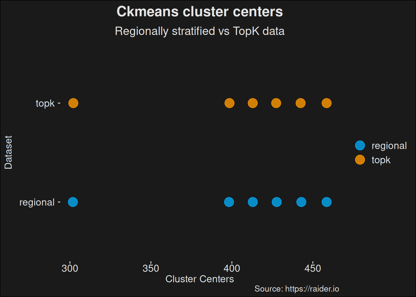
Figure 6.4: Plot comparing clusters computed on the original Subcreation sampling scheme and a top-k sampling scheme. This shows how the clusters move when we change the underlying data set.

We can repeat the same computation Subcreation uses, but on this new data set.

Code
healers_subc_topk <- specs_topk |> filter(role == "healer") |>
  group_by(class_spec) |>
  dplyr::mutate(
    spec_score_mean = mean(score),
    spec_score_sd   = sd(score)
  )

healers_subc_topk <- healers_subc_topk |>
  slice_max(n = 100, score) |>
  reframe(
    class = class,
    spec_score_mean = spec_score_mean,
    score_mean = mean(score),
    score_sd = sd(score),
    n = n(),
    error = qt(.975, n-1) * spec_score_sd / sqrt(n),
    conf.low = score_mean - error,
    conf.high = score_mean + error,
  ) |>
  distinct() |>
  mutate(analysis = "topk")

Running the comparison shows us a major change among the unpopular specs. Remember, in subcreations computation, you pick among the best 100 runs for each healer, but for the unpopular specs, there aren’t even 100 runs. So you pick all of them. If you stratify over region in your data collection, you will get more players from the Asia regions, which runs lower key levels in general, skewing the results.

Code
healers_subc_topk <- healers_subc_topk |> dplyr::select(-spec_score_mean)
ggplot(union_all(healers_subc_base, healers_subc_topk),
  aes(
    x = reorder(class_spec, conf.low),
    y = score_mean,
    color = analysis,
    ymin = conf.low,
    ymax = conf.high)
  ) +
    geom_pointrange(position = position_dodge(width = .5)) +
    coord_flip() +
    labs(title = "Subcreation confidence intervals",
         subtitle = "Regionally Stratified vs TopK data",
         caption = "Source: https://raider.io",
         x = "Specialization",
         y = "Mean score & 95% CI") +
    scale_color_material_d(palette = "light")
Figure 6.5: Compare the Subcreation base computation with a dataset where the top players are picked world-wide rather than being stratified per region. The plot shows how computing data among the true top-k players alters the outcome of the analysis.

6.3 Controlling for repeated measures

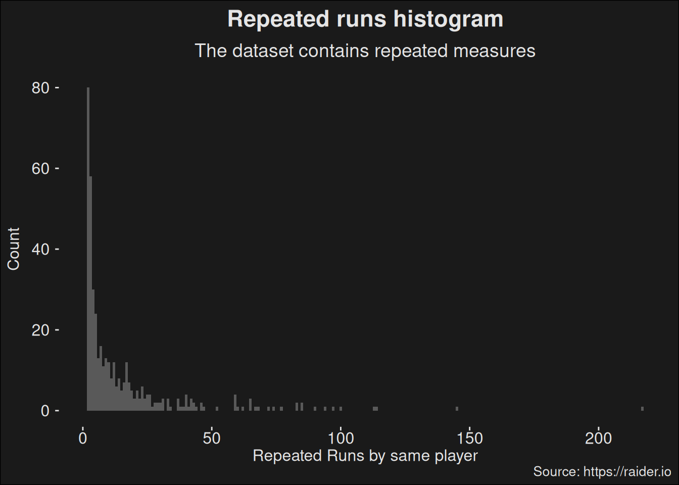
Statistical work often have assumptions which have to be fulfilled for the math to work out as expected. Violating the assumptions voids the correctness of the statistic. One such assumption is independence; each observation is independent of other observations. If you have 7 Protection Paladin runs in Shadowmoon Burial Grounds, the assumption is that those runs are done by 7 different Paladins. If all those 7 runs were done by the same player, it would be wrong to count this as 7 independent samples.

We can analyze the data set for repetitions by grouping on the unique Id of players.

Code
healers |>
 group_by(id) |>
 summarize(count = n(), name = name, class_spec = class_spec) |>
 distinct() |>
 ungroup() |>
 slice_max(n = 12, count) |>
 kbl() |>
 kable_styling()
`summarise()` has grouped output by 'id'. You can override using the `.groups`
argument.
id count name class_spec
138746755 38 Seraphinexd druid_restoration
107425432 32 Vickman druid_restoration
167066565 31 彼岸荼蘼丶 druid_restoration
196877841 30 분홍바다님 priest_holy
205032949 27 Jack druid_restoration
141054056 27 Suruyo druid_restoration
207526639 25 Хвмх druid_restoration
162670429 25 팻스윙 druid_restoration
116492746 25 熊萨 druid_restoration
198265083 24 Hvnzdruid druid_restoration
110998674 24 Moadform druid_restoration
201335396 24 Battleraz druid_restoration
217166781 24 Hananah druid_restoration
197371485 24 소영이야옹 priest_holy
151076708 24 Aleksandru druid_restoration

How do they distribute? We can pick all healers who have played more than a single dungeon run for the given week.

Code
ggplot(
  healers |>
   group_by(id) |>
   reframe(count = n(), name = name, class_spec = class_spec) |>
   filter(count > 1) |>
   arrange(desc(count)) |>
   distinct(),
  aes(x = count)) +
  geom_histogram(binwidth=1) +
  labs(title = "Repeated runs histogram",
       subtitle = "The dataset contains repeated measures",
       caption = "Source: https://raider.io",
       x = "Repeated Runs by same player",
       y = "Count")

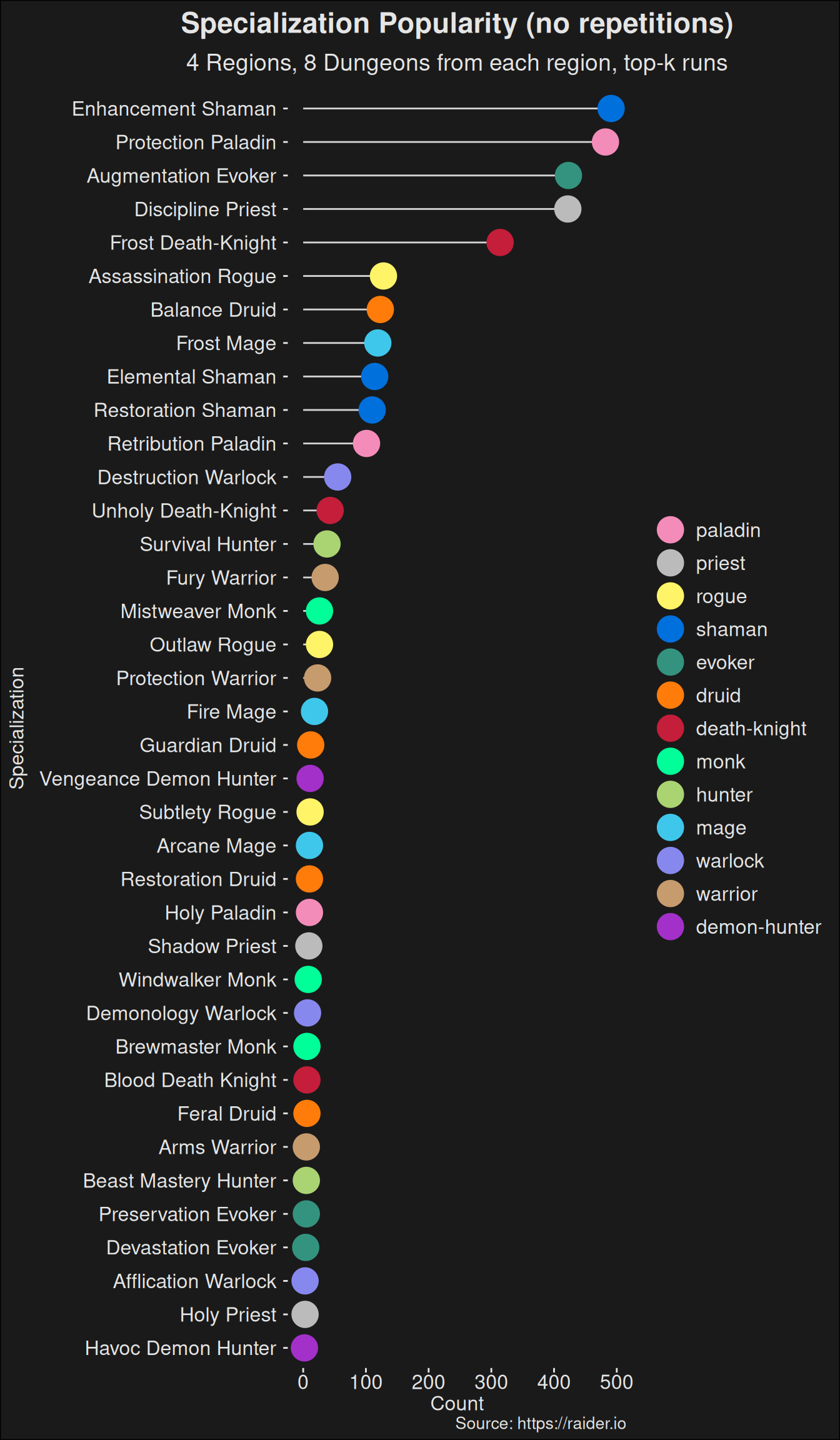
So a lot of runs repeats, and it is very likely to affect our results. This is something you have to control for when handling the data. As an example, we can look at specialization-popularity but control for repetitions in the data set:

Code
specs |>
  group_by(class, class_spec, id) |>
  summarize(id_count = n()) |>
  summarize(count = n(), .groups = "keep") |>
  inner_join(spec_names, by = join_by(class_spec == key)) |>
  ggdotchart(
    x = "class_spec.str",
    y = "count",
    color = "class",
    rotate = TRUE,
    sorting = "descending",
    add = "segments",
    dot.size = 7,
    ggtheme = theme_zugzug()) +
  scale_color_manual(values = wow_colors) +
  labs(title = "Specialization Popularity (no repetitions)",
       subtitle = "4 Regions, 8 Dungeons from each region, top-k runs",
       caption = "Source: https://raider.io",
       x = "Specialization",
       y = "Count")
`summarise()` has grouped output by 'class', 'class_spec'. You can override
using the `.groups` argument.
Figure 6.6: Counting the number of specializations with no repetitions of players. This avoids the pseudoreplication which is present if you just naively count specializations as we did earlier.

Compared to the uncorrected plot, it’s fairly obvious active players have an effect on the outcome. Active players will do more runs, and that leads to a conclusion there are more players at the top level playing a given specialization. The plot in Figure 6.6 is a more accurate way of looking at popularity among specializations.

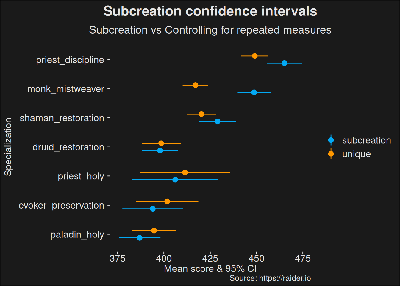
We want to keep individual dungeon runs separated. That is, if a player has run different dungeons, we are assuming they are independent runs. Because we might have dungeon runs at several different key levels and with different times remaining, we remove duplicates. A more advanced model would take the dungeon variability into account as well, but this will do for now.

Code
healers_unique <- healers |>
  dplyr::group_by(dungeon, id) |>
  reframe(
    class_spec = class_spec,
    dungeon = dungeon,
    class = class,
    name = name,
    mean_score = mean(score)) |>
  mutate(score = mean_score) |>
  distinct() |>
  ungroup()

We can now do the same analysis as we did for Subcreation, but on unique healers.

Code
healers_subc_unique <- healers_unique |>
  group_by(class_spec) |>
  dplyr::mutate(
    spec_score_mean = mean(score),
    spec_score_sd   = sd(score)
  )

healers_subc_unique <- healers_subc_unique |>
  slice_max(n = 100, score) |>
  reframe(
    class = class,
    spec_score_mean = spec_score_mean,
    score_mean = mean(score),
    score_sd = sd(score),
    n = n(),
    error = qt(.975, n-1) * spec_score_sd / sqrt(n),
    conf.low = score_mean - error,
    conf.high = score_mean + error,
  ) |>
  distinct()

healers_subc_unique <- healers_subc_unique |> mutate(analysis = "unique")

We see yet another correction has influence in the reported mean values. The general trend is an adjustment downwards, because we don’t let a single healer influence the numbers too much. Some of the more popular specs are heavily influenced by single players who play the spec a lot, which means the skill of a few individual players have a large effect on the perceived power of the specialization.

Code
healers_subc_unique <- healers_subc_unique |> dplyr::select(-spec_score_mean)
ggplot(union_all(healers_subc_base, healers_subc_unique),
  aes(
    x = reorder(class_spec, conf.low),
    y = score_mean,
    color = analysis,
    ymin = conf.low,
    ymax = conf.high)
  ) +
    geom_pointrange(position = position_dodge(width = .5)) +
    coord_flip() +
    labs(title = "Subcreation confidence intervals",
         subtitle = "Subcreation vs Controlling for repeated measures",
         caption = "Source: https://raider.io",
         x = "Specialization",
         y = "Mean score & 95% CI") +
    scale_color_material_d(palette = "light")

6.4 Bootstrapped Confidence Intervals

A core assumption of Subcreation is that the data follows a normal distribution. If the data isn’t normally distributed, chances are this assumption is violated, and the statistics become weak.

Code
ggdensity(healers, x = "score", fill = "grey50", ggtheme = theme_zugzug()) +
  labs(title = "Healer score density plot",
       subtitle = "Scores spike around key levels",
       caption = "Source: https://raider.io",
       x = "Score",
       y = "Density")

Kernel density plot of the healer scores.

We know this dataset isn’t normally distributed. Mythic+ scores are artifically generated by combining key level, affixes, and time remaining in the dungeon. Since the base score for each key level has gaps in between them, our data set has gaps as well. There are certain scores which are unobtainable in between key levels, which violates the assumption the data is normally distributed. We can analyze the data via a Shapiro-Wilk test. This test sets up a hypothesis that the data is normally distributed; then asks “Assuming data are normally distributed, how likely is the data we have?”

If this test comes out with \(p < 0.05\) this data would occur at random less than 5% of the time.

Code
healers |>
  summarize(shapiro.p = tidy(shapiro.test(score))$p.value) |>
  kbl(digits = 3) |> kable_styling()
shapiro.p
0

This value is practically 0, so it fails the test.

A way around this conundrum is to use bootstrapping. We can let a computer grind at the problem by resampling our population and derive a 95% Confidence interval from the resampling. This will then estimate the confidence interval1. A bootstrapped approximation puts us on saner statistical ground than the current computation.

1 This is due to the resampling forming a sampling distribution, which means we can invoke the Central Limit Theorem.

Code
confidence_interval <- function(data) {
  mean <- mean(data$score)
  sd <- sd(data$score)
  n <- length(data$score)
  error <- qt(.975, n-1) * sd / sqrt(n)
  conf.low <- mean - error
  conf.high <- mean + error

  c(conf.low, conf.high)
}

confidence_interval(healers |> slice_max(n = 100, order_by = score))
[1] 225.7531 227.0119

Bootstrapping works by sampling in the sampled scores with replacement2. We create a “new” sample of 100 healers via this resampling, and then we take the mean. This process repeats. If we keep creating “new” samples this way 5000 times, we have 5000 means. These are a sampling distribution, and we can then compute the 95% confidence interval on that distribution.

2 Replacement is a fancy way of saying we can pick the same sample more than once.

Say we do that. We get the following result:

Code
boot_fn <- function(data, indices) {
  d <- data[indices, ]

  mean(d$score)
}

bootres <- boot(
  healers |> slice_max(n = 100, order_by = score),
  boot_fn, R=5000)
tidy(bootres, conf.int = TRUE) |> kbl(digits=3) |> kable_styling()
statistic bias std.error conf.low conf.high
226.383 0.004 0.315 225.76 227.007

We can also compute it on a per-spec basis:

Code
run_boot <- function(d) {
  bootres <- boot(d, boot_fn, R=5000)

  bootres
}

healers_boot_ci <- healers |>
  group_by(class_spec) |>
  slice_max(n = 100, order_by = score) |>
  nest() |>
  mutate(bootres = map(data, run_boot)) |>
  mutate(tidy = map(bootres, broom::tidy, conf.int = TRUE)) |>
  unnest(tidy) |>
  mutate(data = NULL, bootres = NULL)

healers_boot_ci |> kbl(digits = 3) |> kable_styling()
class_spec statistic bias std.error conf.low conf.high
druid_restoration 226.429 -0.002 0.321 225.786 227.042
shaman_restoration 211.640 -0.008 0.439 210.794 212.518
priest_holy 211.387 -0.008 0.365 210.653 212.097
monk_mistweaver 213.220 0.004 0.209 212.838 213.653
priest_discipline 209.388 0.005 0.402 208.636 210.195
evoker_preservation 209.563 -0.001 0.418 208.745 210.386
paladin_holy 207.833 0.001 0.465 206.954 208.795

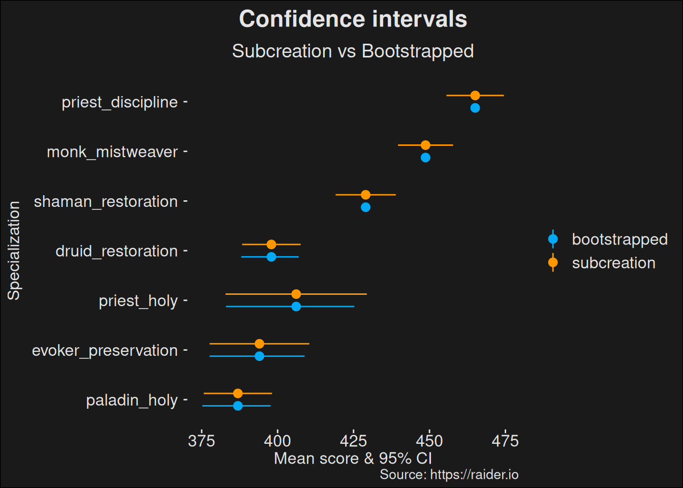
Let us compare the bootstrap to the original subcreation computation. We can plot this, which is a better way of understanding the differences, than looking at a table.

Code
healers_boot_ci <- healers_boot_ci |>
  rename(
    conf.low = conf.low,
    conf.high = conf.high,
    score_mean = statistic) |>
  mutate(analysis = "bootstrapped")
Code
union_all(
  healers_subc_base |> dplyr::select(
    class_spec, score_mean, conf.low, conf.high, analysis),
  healers_boot_ci |> dplyr::select(
    class_spec, score_mean, conf.low, conf.high, analysis)) |>
  ggplot(aes(
    x = reorder(class_spec, conf.low),
    y = score_mean,
    color = analysis,
    ymin = conf.low,
    ymax = conf.high)
  ) +
    geom_pointrange(position = position_dodge(width = .5)) +
    coord_flip() +
    labs(title = "Confidence intervals",
         subtitle = "Subcreation vs Bootstrapped",
         caption = "Source: https://raider.io",
         x = "Specialization",
         y = "Mean score & 95% CI") +
    scale_color_material_d(palette = "light")
Figure 6.7: Bootstrapped confidence intervals compared to the Subcreation base computation.

One advantage of this approach is that it is more robust against changes in the underlying data. We see the derived confidence intervals via bootstrapping tends to be smaller. If we want to analyze if specs are different, having smaller confidence intervals tend to be better because there will be less overlap of the intervals. Usually this will let us tease out smaller effects from the data.

6.5 Combining all the Alternatives

We have a number of alternative suggestions for Subcreation. These are:

  • Use the full sample
  • Control for regional effects by pulling a true topk dataset
  • Control for repeated measures from players
  • Bootstrap the confidence interval

Combining all these suggestions is an obvious idea, which should yield better results.

6.5.1 Healers

Because we want to run the computations for healers, tanks, and dps, we benefit from setting up a function for doing the computation. The function preprocess combines all our controls and runs them in order.

preprocess <- function(df, tag) {
  # Handle repeated measures by averaging players over their multiple runs of the same dungeon
  df <- df |>
    dplyr::group_by(dungeon, id) |>
    dplyr::reframe(
      class_spec = class_spec,
      dungeon = dungeon,
      class = class,
      name = name,
      mean_score = mean(score)) |>
    mutate(score = mean_score) |>
    distinct() |>
    ungroup()

  # Bootstrap a confidence interval
  df <- df |>
    group_by(class, class_spec) |>
    filter(n() > 3) |>
    nest() |>
    mutate(bootres = map(data, run_boot)) |>
    mutate(tidy = map(bootres, broom::tidy, conf.int = TRUE)) |>
    unnest(tidy) |>
    mutate(data = NULL, bootres = NULL) |>
    ungroup()

  # rename columns to fit the rest of the data here
  df <- df |>
    rename(
      conf.low = conf.low,
      conf.high = conf.high,
      score_mean = statistic) |>
    mutate(analysis = tag)

  df
}

With this function in hand, we can easily run the computation for different roles. We’ll focus on healers first.

Code
healers_combined <- preprocess(specs_topk |> filter(role == "healer"), "combined")

And make our usual plot. It is nice to have a stand-alone plot of healers in this case.

Code
ggplot(healers_combined,
  aes(
    x = reorder(class_spec, conf.low),
    y = score_mean,
    color = class,
    ymin = conf.low,
    ymax = conf.high)
  ) +
    geom_pointrange() +
    geom_point(aes(y=conf.low), color="white", size=1.5) +
    scale_color_manual(values = wow_colors) +
    geom_hline(yintercept=clusters_topk$centers, lty="dashed", color="white") +
    coord_flip() +
    labs(title = "Corrected Subcreation confidence intervals",
         subtitle = "4 corrections applied to the Subcreation analysis",
         caption = "Source: https://raider.io",
         x = "Specialization",
         y = "Mean score & 95% CI")

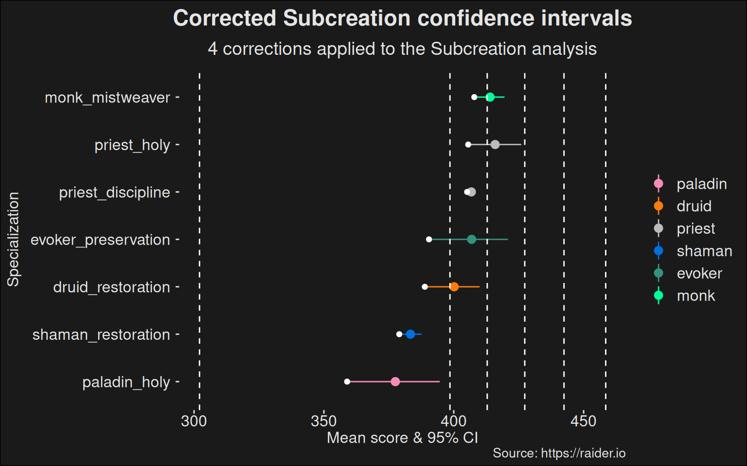
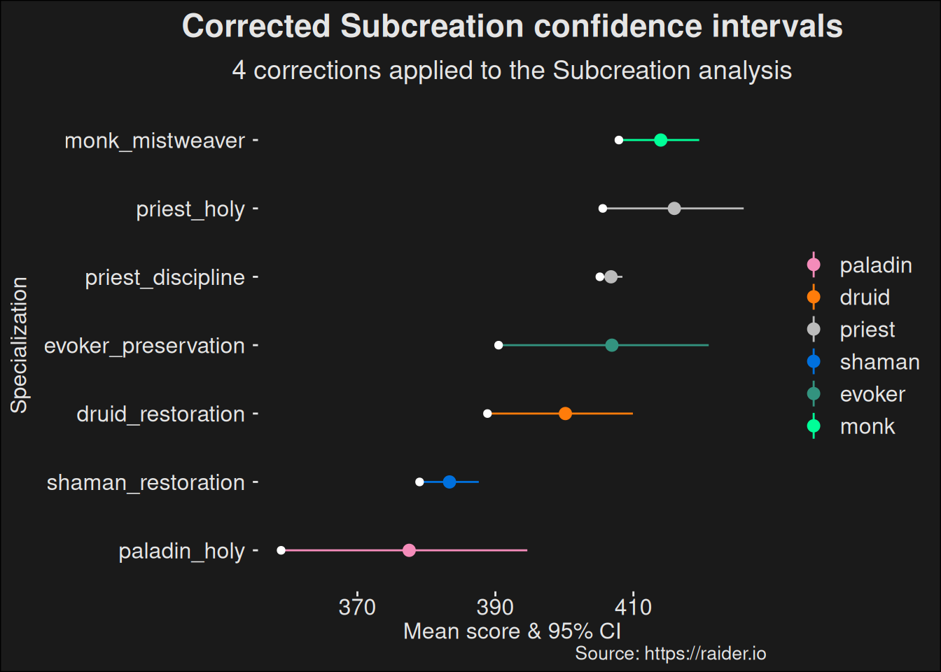
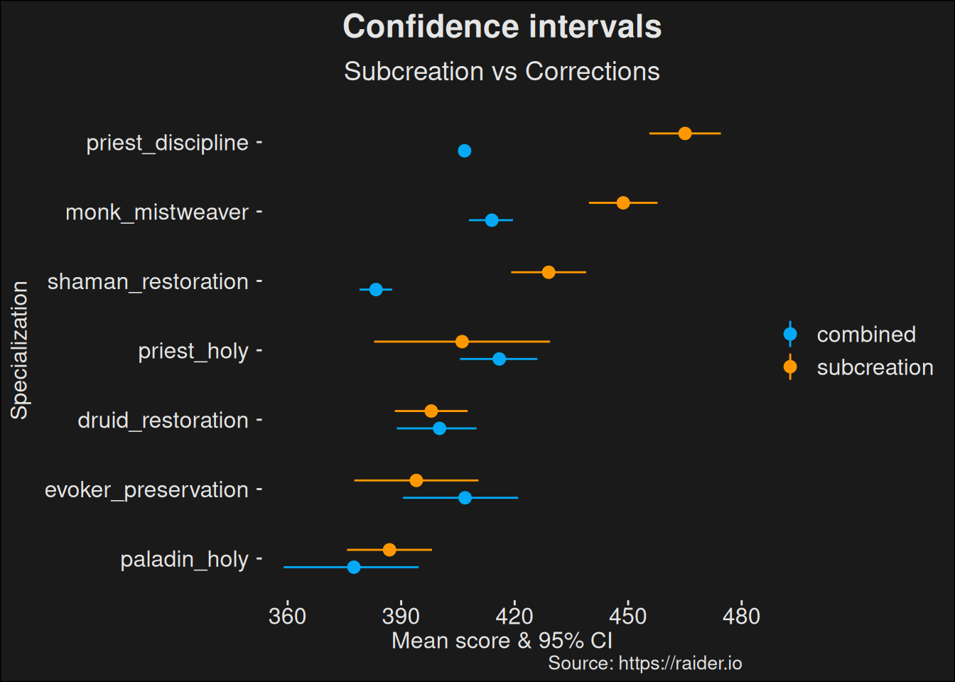
Once we control for undesired effects, it becomes clear the healers tend to be far more balanced. The difference in rating between the best and worst healer becomes far smaller. Because they are so close, we also provide a zoomed-in view with no clustering:

Code
ggplot(healers_combined,
  aes(
    x = reorder(class_spec, conf.low),
    y = score_mean,
    color = class,
    ymin = conf.low,
    ymax = conf.high)
  ) +
    geom_pointrange() +
    geom_point(aes(y=conf.low), color="white", size=1.5) +
    scale_color_manual(values = wow_colors) +
    coord_flip() +
    labs(title = "Corrected Subcreation confidence intervals",
         subtitle = "4 corrections applied to the Subcreation analysis",
         caption = "Source: https://raider.io",
         x = "Specialization",
         y = "Mean score & 95% CI")

Finally, we can compare our findings with the base. Subcreations data compared to ours:

Code
union_all(
  healers_subc_base |> dplyr::select(class_spec, conf.low, conf.high, score_mean, analysis),
  healers_combined |> dplyr::select(class_spec, conf.low, conf.high, score_mean, analysis)) |>
  ggplot(aes(
    x = reorder(class_spec, conf.low),
    y = score_mean,
    color = analysis,
    ymin = conf.low,
    ymax = conf.high)
  ) +
    geom_pointrange(position = position_dodge(width = .5)) +
    coord_flip() +
    labs(title = "Confidence intervals",
         subtitle = "Subcreation vs Corrections",
         caption = "Source: https://raider.io",
         x = "Specialization",
         y = "Mean score & 95% CI") +
    scale_color_material_d(palette = "light")

Code
distances <- tibble(analysis = factor(c("corrected", "subcreation")),
                    distance = c(max(healers_combined$conf.low) - min(healers_combined$conf.low),
                                 max(healers_subc_base$conf.low) - min(healers_subc_base$conf.low)))
distances
# A tibble: 2 × 2
  analysis    distance
  <fct>          <dbl>
1 corrected       1.82
2 subcreation    18.9 

Note how much the distance between the best and worst specs have shrunk. The balance window closes. This means the difference in power is going to be a small effect, and other factors, such as player skill, are going to dominate. This is good for the game, as you’d like to pick better players than relying on specialization power to construct a roster for a dungeon run.
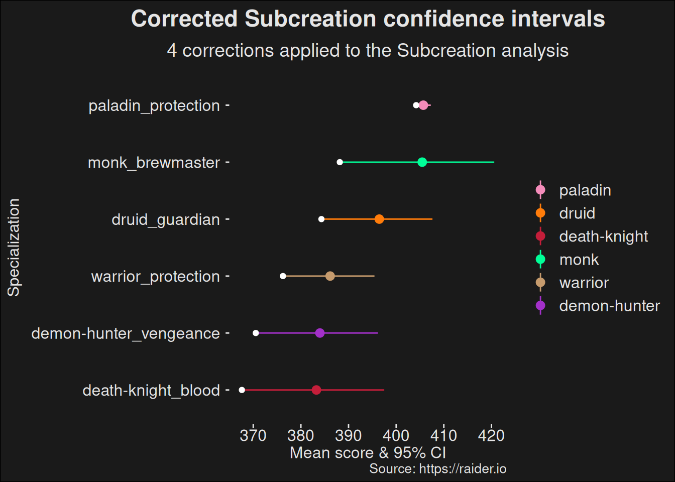
6.5.2 Tanks

With the preprocess function in hand, we can now focus on tanks:

Code
tanks_combined <- preprocess(
  specs_topk |> filter(role == "tank"),
  "combined")

tanks_combined |>
  dplyr::select(-analysis) |>
  kbl(digits = 3) |> kable_styling()
class_spec class score_mean bias std.error conf.low conf.high
demon-hunter_vengeance demon-hunter 204.264 0.000 0.074 204.120 204.409
paladin_protection paladin 203.312 -0.006 0.349 202.636 203.994
druid_guardian druid 203.122 -0.013 0.534 202.070 204.166
death-knight_blood death-knight 202.974 -0.004 0.444 202.090 203.826
monk_brewmaster monk 202.769 0.009 0.763 201.290 204.280
warrior_protection warrior 202.286 -0.009 0.634 201.101 203.558

Like in the previous work on healers, we don’t need the cluster centers anymore, so we’ll make a plot without those. This lets us focus on where the differences are and how large of a difference there is.

Code
ggplot(tanks_combined,
  aes(
    x = reorder(class_spec, conf.low),
    y = score_mean,
    color = class,
    ymin = conf.low,
    ymax = conf.high)
  ) +
    geom_pointrange() +
    geom_point(aes(y=conf.low), color="white", size=1.5) +
    scale_color_manual(values = wow_colors) +
    coord_flip() +
    labs(title = "Corrected Subcreation confidence intervals",
         subtitle = "4 corrections applied to the Subcreation analysis",
         caption = "Source: https://raider.io",
         x = "Specialization",
         y = "Mean score & 95% CI")

6.5.3 DPS

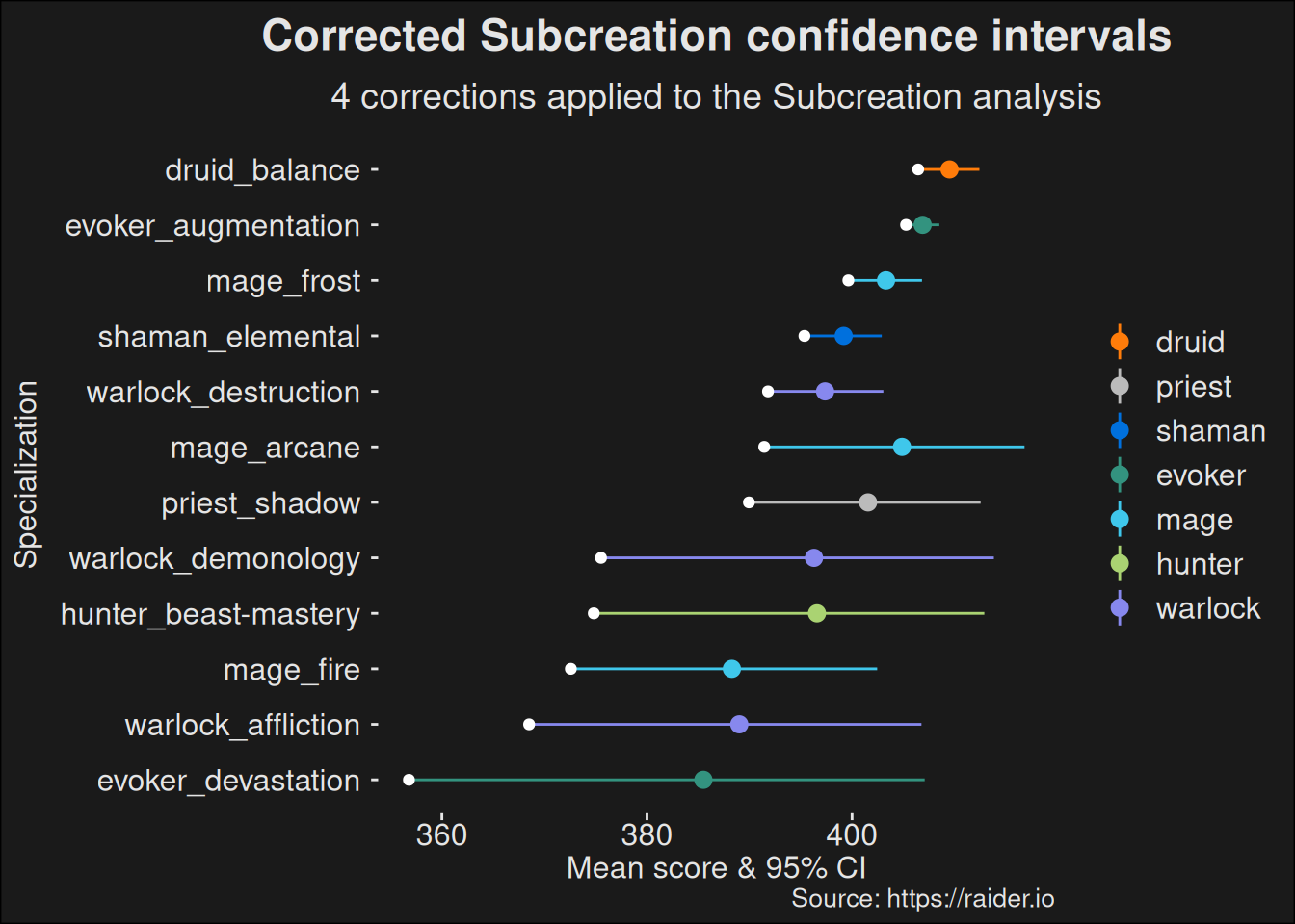
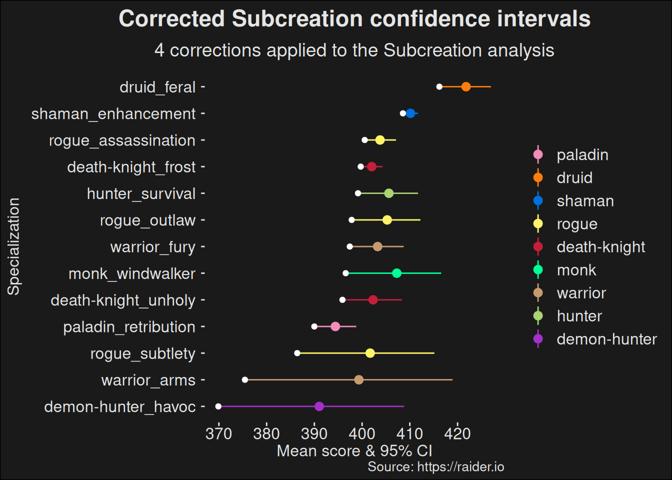
For convenience, we split the DPS role into ranged and melee. This keeps the plot in a size that is readily workable and easy. It is also common practice in a lot of data expositions about specializations in WoW to do so. We’ll just follow suit.

By now, the drill is known, so we’ll just bring the plots

6.5.3.1 Ranged

Code
ranged_combined <- preprocess(
  specs_topk |> filter(role == "dps" & is_ranged == "Yes"),
  "combined")
Code
ggplot(ranged_combined,
  aes(
    x = reorder(class_spec, conf.low),
    y = score_mean,
    color = class,
    ymin = conf.low,
    ymax = conf.high)
  ) +
    geom_pointrange() +
    geom_point(aes(y=conf.low), color="white", size=1.5) +
    scale_color_manual(values = wow_colors) +
    coord_flip() +
    labs(title = "Corrected Subcreation confidence intervals",
         subtitle = "4 corrections applied to the Subcreation analysis",
         caption = "Source: https://raider.io",
         x = "Specialization",
         y = "Mean score & 95% CI")

6.5.3.2 Melee

Code
melee_combined <- preprocess(
  specs_topk |> filter(role == "dps" & is_ranged == "No"),
  "combined")
Code
ggplot(melee_combined,
  aes(
    x = reorder(class_spec, conf.low),
    y = score_mean,
    color = class,
    ymin = conf.low,
    ymax = conf.high)
  ) +
    geom_pointrange() +
    geom_point(aes(y=conf.low), color="white", size=1.5) +
    scale_color_manual(values = wow_colors) +
    coord_flip() +
    labs(title = "Corrected Subcreation confidence intervals",
         subtitle = "4 corrections applied to the Subcreation analysis",
         caption = "Source: https://raider.io",
         x = "Specialization",
         y = "Mean score & 95% CI")

6.6 Remarks

We’ve traced the computations done by Subcreation and then provided a series of corrections to the computations. Before these corrections, the balance window reported by Subcreation is fairly large.

However, once you control for undesirable data effects, the balance window almost closes.

The findings here are presented one change at a time with a comparison, because it allows people to make their own informed decision on what they believe.

Should Subcreation want to implement some of this, they have the option. They can pick whatever they want among the options, including those they think are correct.

The key take-away is that something can be statistically significant, but have small effect. This is especially true if you have a lot of observations. The statistics can squeeze out significance, even for very minuscule differences among the specializations. I think this is what is happening here, and it is happening across all roles. Except for a few outliers, most specs fall into a very small window.

Some of the suggestions here are outright hacks3. By this, I mean they fix problems with the approach, but does so with a focus on being rather simple fixes to add to the Subcreation site. This is deliberate. I’d much rather see some of the suggestions here implemented, even if they are simple in nature. Other chapters address the specialization power question with a stronger toolbox from statistics: bayesian inference. This approach is arguably the correct one, but it also involves a lot more machinery, is computationally heavy, and requires one to work with a probalistic programming language such as stan.

3 Here a hack means overcoming an obstacle via non-traditional means